EMUN
Client: EMUN – Euskara and Social innovation
Agency: di-da
Role: Creative Direction
Date: 2013
Client: EMUN – Euskara and Social innovation
Agency: di-da
Role: Creative Direction
Date: 2013
The EMUN cooperative has been promoting the Basque language in the workplace for over 15 years. They offer a comprehensive service that helps businesses and institutions implement policies that address language, culture, immigration and social inclusion.
As creative director, my role was to redesign EMUN’s visual brand identity, reflecting their personality and their heritage. Together with a detailed brand audit, and a comprehensive communications strategy, EMUN has strengthened its position as the leading consultancy in its field.
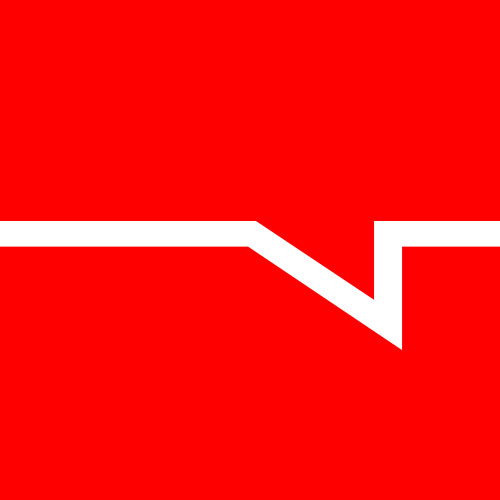
In order to encompass EMUN’s personality and to add value to the EMUN name, we created the tagline: “Euskara eta berrikuntza soziala” (Basque language and social innovation). The symbol is a speech bubble that is drawn from the ‘heart’ of the letter ‘e’ (E for Euskara and E or EMUN). It is flipped 180º to represent that EMUN listen to the client’s voice first and foremost, before offering their professional advice. The licensed typeface used is Sansa Condensed (Ourtype), and the corporate colour is a deep purple symbolising confidence, elegance and quality. Whatsmore, the corporate colour purple is the result of a fusion of the 4 colours that represent EMUN’s 4 different departments (blue, yellow, red and green).

Brand strategy, naming and identity for Wild + Free adventures in Donegal, Ireland
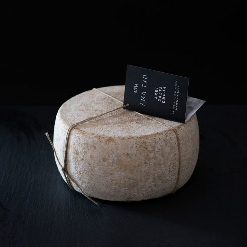
Brand identity design for an enterprising Basque cheese business based in Antzuola, Gipuzkoa.
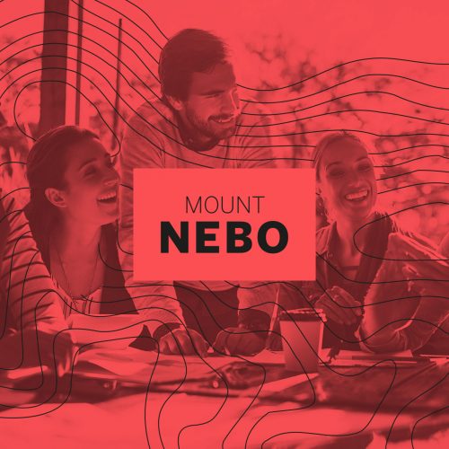
Brand identity design for Mt Nebo, a conference in Germany for twenty something Christian business leaders

Brand identity design for a Christian discipling training series by Spark Europe (Germany).
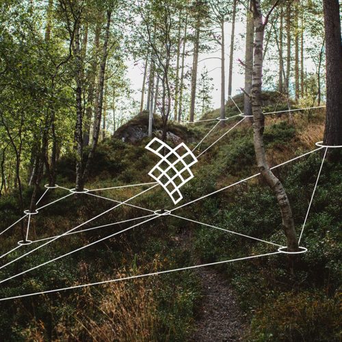
Brand identity design for a grassroots organisation that promotes sustainable development in Busturialdea.
Brand identity design for a social enterprise initiative in Germany helping refugees integrate into society
Logo design submission to rebrand English Surfing
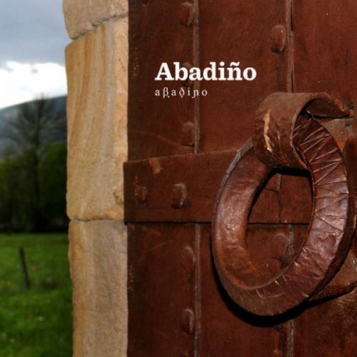
Creative direction, design and translation (into English) of 'Abadiño', a book about the Basque town
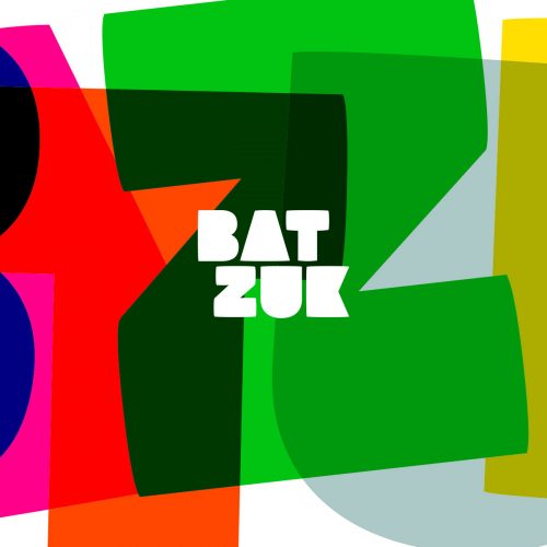
Brand identity design for the 20th Korrika - a 10-day marathon in support of the Basque language.
Brand identity design for Zukuka Bora, an ethical coffee business from Mt Elgon, Uganda

Brand identity design for Longhurst Electrical Services, based in the South East of England
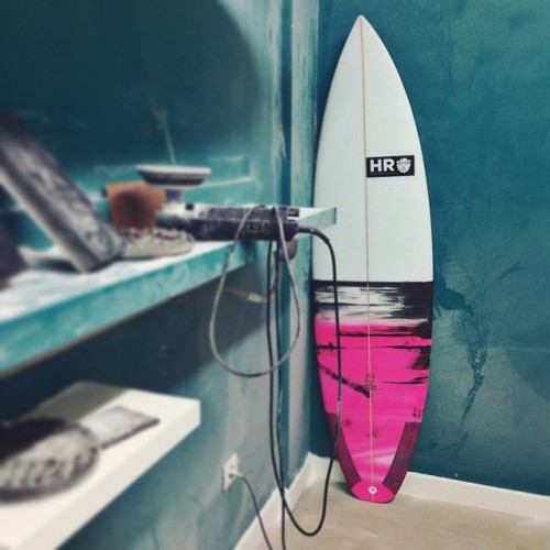
Brand identity design for Hiucif Rahim Surfboards, a skilled shaper from Gijon, Spain
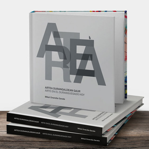
Creative direction and design of 'Artea Durangaldean Gaur', a publication featuring contemporary Basque artists
Strategic brand identity design for a bike store in Durango, Basque Country
Creative direction and brand identity design for the 17th Korrika
Brand identity design for Emun, a cooperative that promotes the Basque language within the workplace

Brand identity design for Andramari Ikastola, a Basque school in Amorebieta-Etxano
Creative direction, strategic branding and design for The Surf Project, an Irish Christian surf ministry
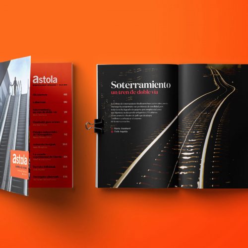
Creative direction and design of Astola, the Basque Country's answer to National Geographic
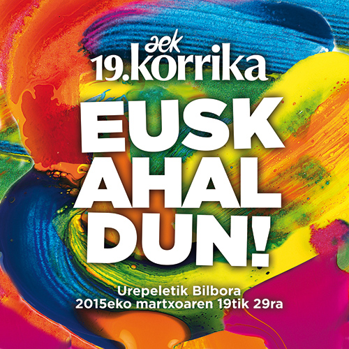
Creative direction and brand identity design for the 19th Korrika
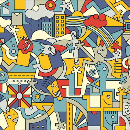
Creative direction and brand identity design for the 18th Korrika
Creative direction and design for Zarautz town hall
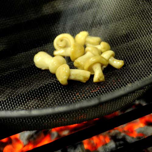
Creative direction and design for Etxebarri restaurant in Axpe, Basque Country
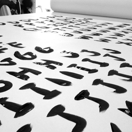
Original typeface design for screen credits, used on a film by Debolex
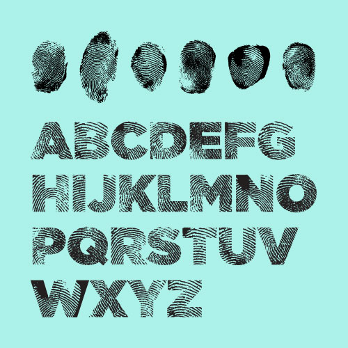
Typeface design based on fingerprints, for a cultural film by Debolex
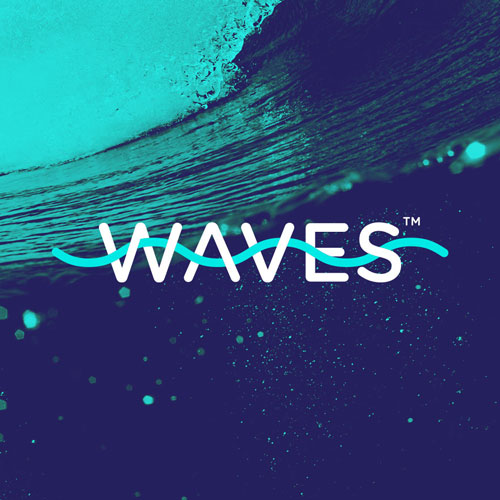
Brand identity design for Waves, a Christian small group initiative with a global reach
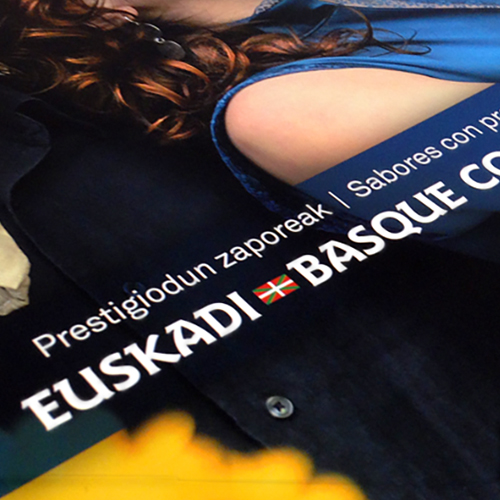
Creative direction and design for a publication by the Basque government on local gastronomy
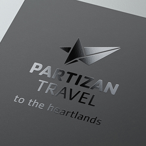
Creative direction, brand identity and naming for Partizan Travel
Brand identity and design for Akorda taberna, a restaurant and bar on the Basque coast

Creative direction, brand development and design for University Technical Colleges, UK
Brand identity design for Oihaneder Euskararen Etxea in Gasteiz, Basque Country
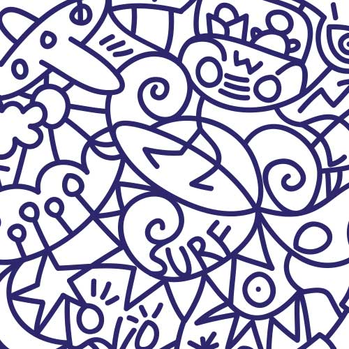
Creative direction and brand identity for this personal project - a non-profit surf initiative that promotes cultural awareness
Brand identity design and Creative Direction for Durnagoko Azoka - the largest cultural fair in the Basque Country.
Brand identity design for Tokikom, a Basque publishing house with 76 media outlets
Other Work