Date
January 2020
Client
Spark Network (Germany)
Design
Visual brand identity
Spark Network in Germany, asked me to develop a visual brand identity for their intern course entitled “Thin Places”, that helps people share their faith with neighbours in their local community.
Ancient Celts first coined the term “Thin Places” to describe special locations such as the wind-swept isle of Iona (Scotland) or the rocky peaks of Croagh Patrick (Ireland). As the Celtic saying goes, “Heaven and earth are only three feet apart, but in thin places that distance is even shorter.”
The symbol in the logotype represents community, the trinity based on an ancient Celtic symbol, three separate identities coming together (WIR, GOTT and ANDERE), space (in the centre of the symbol) and the letters ‘T’ and ‘P’ as an infinite bond.
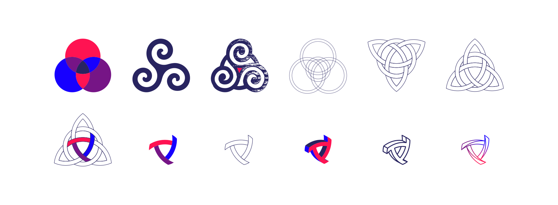
Colours
Blue, Purple and Scarlet feature in the Old Testament book of Exodus, when God gave instructions to build the tabernacle (the most holy place).
Blue
#1800ff
Purple
#761687
Scarlet
#ff1453