Date
2017
Client
Surfing Great Britain
Design
Logo design competition
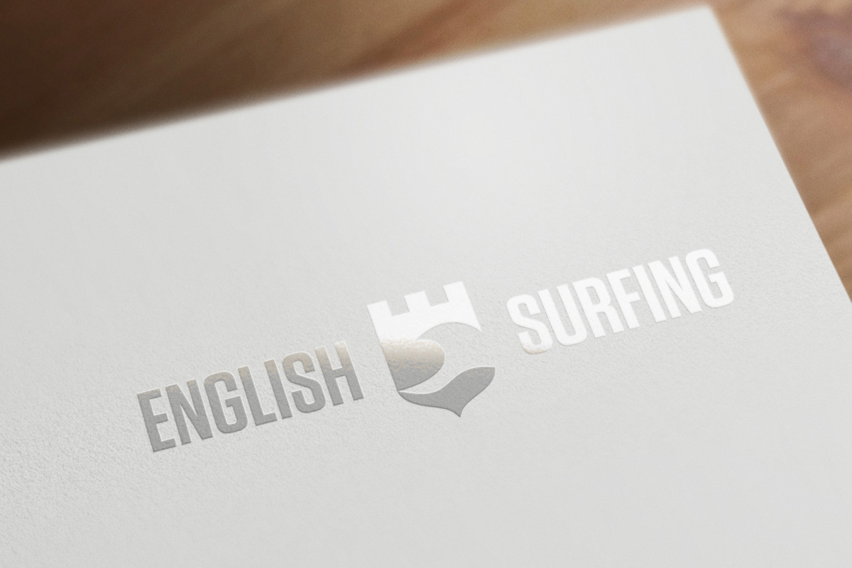
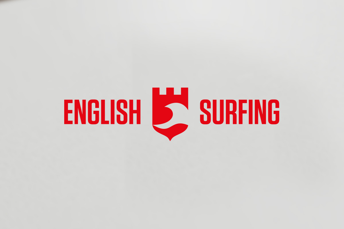
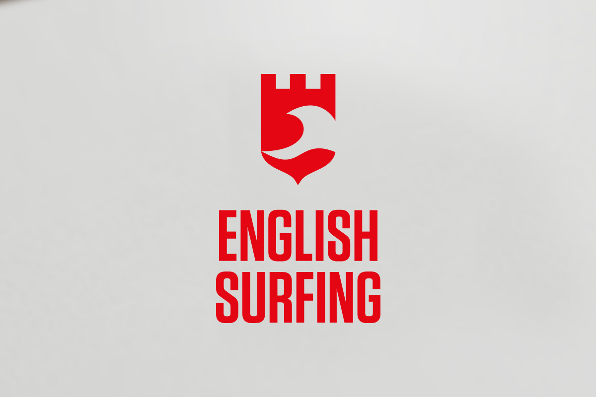
In 2017, Surfing Great Britain (now Surfing England) ran a design competition to rebrand the national organisation under the name “English Surfing”. After submissions were accepted, organisers axed the competition and contracted Wavelength Media to take on the job instead. So as not to relegate my work entirely to the design graveyard, I’m happy to share it here.
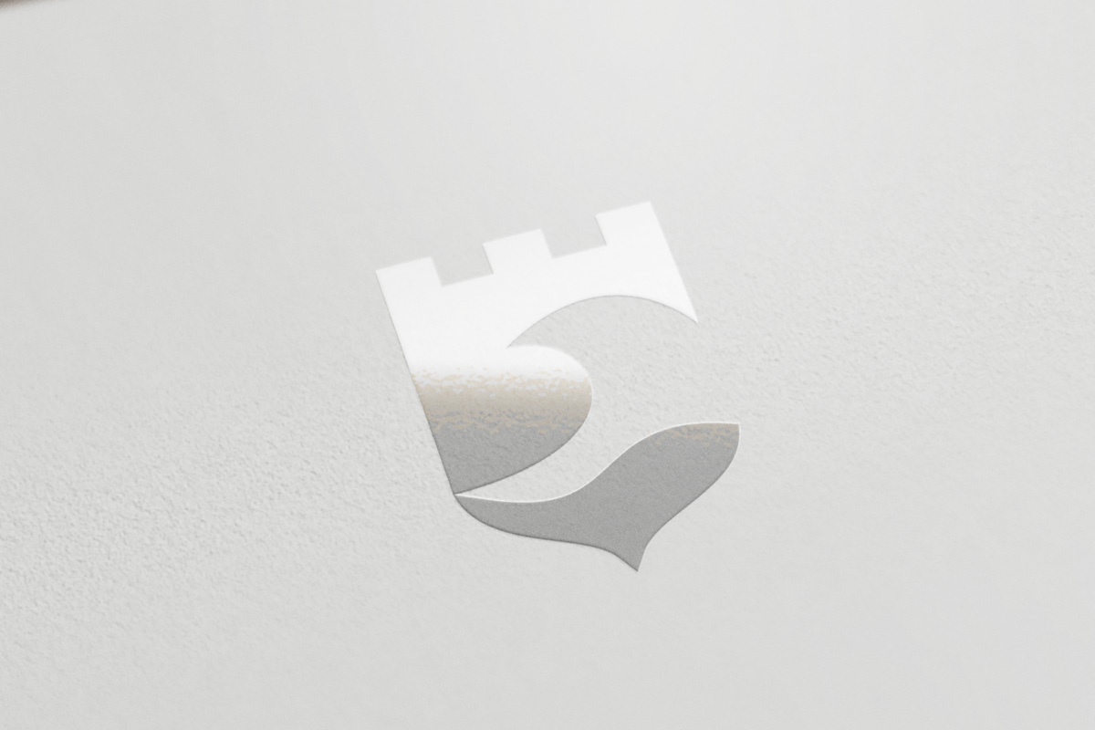
“An Englishman’s home is his castle”, or in this case, his coastline. From ancient fleets to modern day organisations such as the RNLI and Surfers Against Sewage, England has a rich heritage of defending and protecting its shores. English Surfing as a national body on the world stage (for example, the Olympics), represents this heritage, wearing its shield with pride as competitors strive for excellence. At the top of the shield is the letter E for English (on its side), and the strong colours are a nod to the flag of St George. The fish at the bottom was a happy accident, I have to admit.

This is the final logo that was chosen, and again, just to be clear, this is not my design. The competition attracted the attention of different brand and creative agencies, and Wavelength Media was selected to rebrand the organisation.
Abadiño
Abadiño
The Surf Project
The Surf Project

University Technical Colleges