Date
April 2018
Client
Spark Network (Germany)
Design
Visual brand identity
KUNA (meaning “together” in Esperanto), is an inclusive, social enterprise initiative of Spark Network (Germany), that helps foreign refugees integrate into a new life in Germany.
Diversity in terms of race, colour and creed, can unfortunately cause division in society. The KUNA initiative not only gives refugees sanctuary, refuge, food and shelter, but it helps to equip them professionally too, that they may be independent, finding love, value and purpose on foreign soil.
The logotype is a bold representation of these values. It stands strong in the face of adversity as a loud advocate of compassion, love and inclusion.
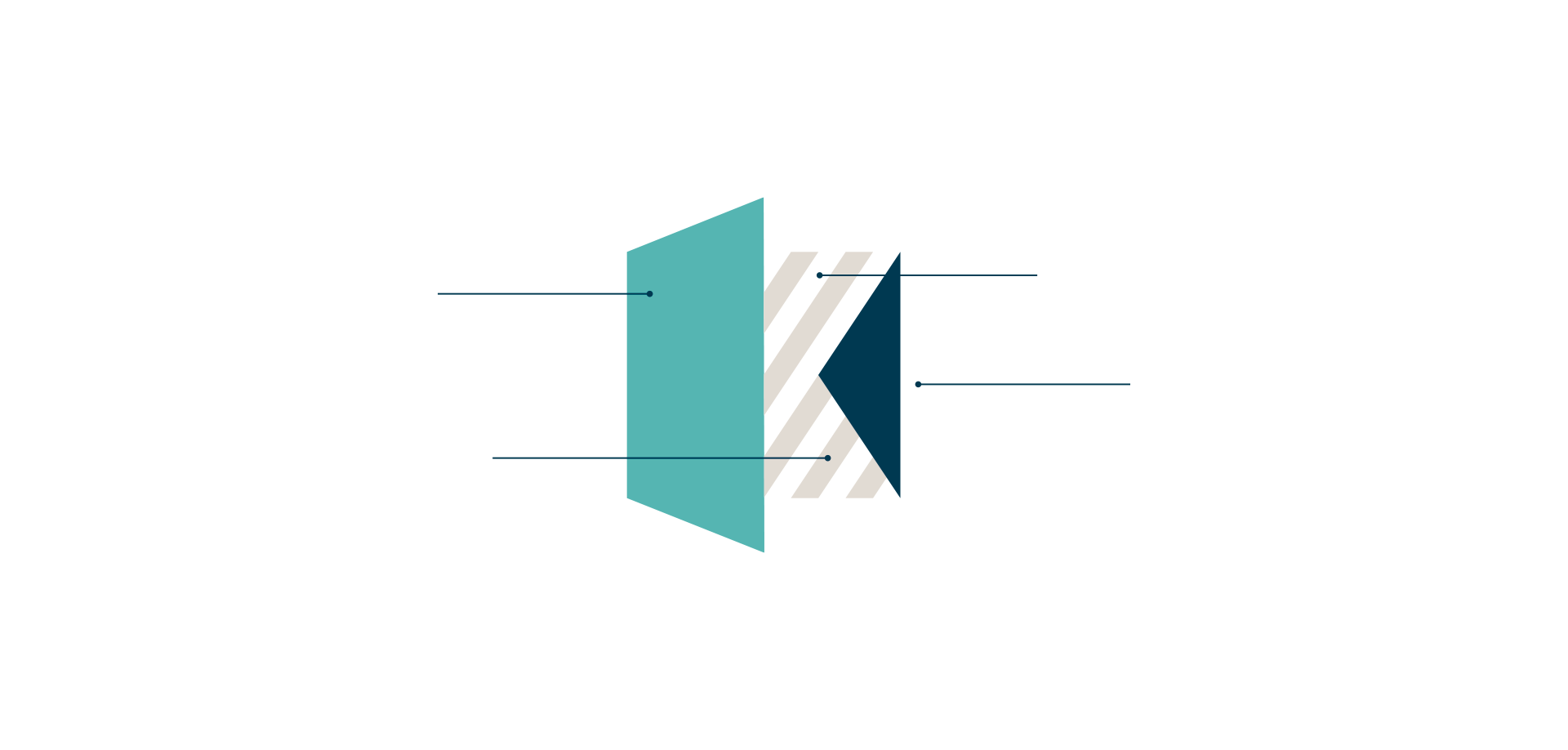
1
OPEN DOOR – An invitation to participate
2
DIVERSITY – An abstract representation of the diversity that KUNA offers, both in its uses as a building as well as in the people that attend.
3
OPEN SPACE – The negative white space is the letter “K” for KUNA and symbolises the physical location.
4
ARROW – Drawing people together, a fusion, a bond, a join, social inclusion, integration.
Colours
Green
#50b8b1
Beige
#d7d1c8
Navy
#003951
Longhurst Electrical Services
Longhurst Electrical Services
The Surf Project
The Surf Project
Zarautz ehuntzen